It’s the end of the world as we know it, and Best Products is having a sale.
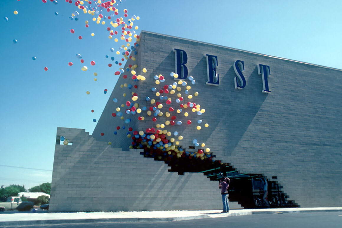
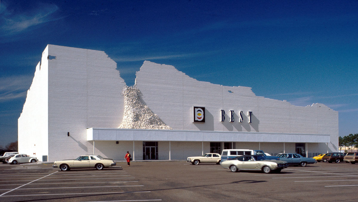
One of SITE's striking retail creations, the "Indeterminate Facade," in Houston, Texas, around 1975. COURTESY OF SITE
In 1974, the American home goods retailer Best Products opened a new location in Houston, Texas. Crowds gathered for the event, and local news trucks filmed the scene.
But people weren’t there to shop. Everyone was in the parking lot, waiting for two helicopters to lift a massive black shroud off of the building, like a giant magic trick. When they finally pulled it away, the crowd burst into applause.
From 1972 to 1984, Best Products collaborated with the design firm SITE to transform many of its stores into stunning and bizarre works of art. These special showrooms, as they were called, generated fanfare, admiration, and controversy across the United States. They were hotly debated in architecture circles, and ultimately became textbook examples of postmodern architecture—playful and critical, providing mass appeal while challenging assumptions about how “serious” art should look, and where it should be found.

By the mid-1990s, they had all disappeared.
SITE was founded in 1970 by a multidisciplinary group of New York artists, and led by James Wines, a sculptor steeped in the downtown New York arts scene. Prior to founding the firm Wines often took public-art commissions, which at the time usually meant making large sculptures in urban public spaces. With abstract, monumental pieces like Three Bronze Discs (1967), Wines was finding the kind of success that many sculptors dreamed of. And he was sick of it.
Enjoying This Story?
Get our latest, delivered straight to your inbox by subscribing to our newsletter.
“I was designing turds in a plaza,” Wines describes. He wanted to break free of the form, which felt like it promoted work that could be found in any plaza or skyscraper lobby in the world—from Lower Manhattan to Louisville to Luxembourg. “Plop Art,” Wines likes to say.
Two of Wines’s patrons in this period were Sydney and Francis Lewis. They owned Best Products, a catalogue retailer that sold discounted goods in hybrid showroom/warehouses (sort of like Ikea). Selling everything from hair dryers to toaster ovens to doll-houses, they were proto-big box stores—“medium box stores,” as their son and former Best president Andy Lewis puts it.
The Lewises were avid art collectors, and as the company grew they became interested in bringing public art in their showrooms. They turned to Wines, who by the late 1960s had become not only one of their favorite young artists, but also a good friend.
Wines is in his 80s today, but still has the excitable temperament of a young artist looking to surprise. He smiles when he talks about those first discussions with the Lewises.
“I think, at first, they imagined I would just put a sculpture in front of the store,” Wines says. But that wasn’t the kind of proposal he gave them.
Their first collaboration, for a new showroom in Richmond, Virginia, was ingeniously simple. It featured a brick facade layered in front of a generic box store, bound with a special mortar that let the bricks seemingly defy gravity. The facade curled away from the building at its edges, like drying paper. It was called the “Peeling Building.”

According to Andy Lewis, when the store opened in 1971 people visited just to see the facade in person. One neighbor even called the Lewises to tell them their new showroom was severely damaged. The “Peeling Building” soon became their best performing location. The Lewises decided to collaborate with Wines and SITE on another.
For the “Indeterminate Facade Building” in Houston, the opening of the store was turned into a major event. When helicopters finally lifted the black shroud off the building, what was revealed looked pretty mundane—until the top. The white facade rose two stories above the building and ended at a jagged, crooked line of bricks. A large V appeared punched out of it, with a pile of brick rubble below.
At the opening, a local whom Wines had never met walked straight up to him, with an intensity that put him on edge.
“I thought he was gonna try and fight me,” Wines says. “‘Did you do that?’ He asked. I told him I did. ‘I love it! That’s what I always have wanted to do, kick the shit out of one of those buildings.’”
Some architects, though, didn’t view the showrooms so kindly. The May 1977 issue of Architectural Record contains several scathing letters to the editor, including one from a California-based reader who called the buildings “an affront to human dignity, an insult to architectural innovativeness and stooping to the lowest on the altar of gimmickry.” A construction company owner in New York suggested SITE, Inc. be given the architectural award for “Sheer Lunacy.” For some designers and critics, there was just no room for playful suburban shopping centers in the world of fine architecture.
Wines was too busy to debate the point. Best Products was growing fast in the ’70s and ’80s, and there were more showrooms to design. Over the next few years came seven more. There was the “Notch Building” in Sacramento, a solid concrete box with one corner that would slide out to create an entrance when it opened each day, and slide back in at night.

In Richmond, Virginia, the “Forest Building” was designed to look like a big box store that had been sitting for decades in a vacant lot.

The “Inside/Out Building” in Milwaukee had a cutaway section that appeared to expose the interior to the outside, like a real-life architectural cross-section. “They cost more than regular buildings, but they added such PR value. Often they were our best-performing stores,” Andy Lewis explains.

By the late ’80s though, a creeping consolidation of big-box retailers had begun, and Best Products started to struggle. After two bankruptcies in 1991 and 1996, the company closed for good.
Unlike more monumental architecture of the era, no one seems to have thought to preserve these big-box stores. Describing the fate of the Houston showroom in a 2003 Metropolis article, the architectural historian Stephen Fox put it this way: “there’s not much sentiment here for preserving suburban landmarks.” Over the years the showrooms were bought and sold, remodeled and torn down.
There is still one place, though, where admirers can catch a glimpse of what once was. On a strip-mall-lined stretch of Quioccasin Road in Richmond, Virginia, sits the West End Presbyterian Church. It has a brick facade with a courtyard just behind it. It was once the “Forest Building.”
When it opened as a Best showroom in 1978, the building was covered in weeds, with trees seeming to burst out from its interior. In 2000, when the West End church converted the building to a house of worship, they hired very responsible architects to civilize the space.
The church’s website mentions the building’s unique history, and architecture students have begun making trips there to see it themselves. To Wines though, it’s not really worth visiting—the tasteful and orderly renovation almost felt like a defacement. “It was like they surgically removed all the art from the building,” he says.
Robert Venturi and Denise Scott-Brown, icons of ‘70s and ‘80s postmodern architecture, were fans of SITE’s special showrooms. (In 1978, as Best Products was rapidly expanding, they actually designed one themselves.) Once, when discussing the special showrooms with Wines, Venturi said something to him that would prove prophetic: “Make sure to take lots of pictures. In about 15 minutes they’ll start to change it.”


Đăng nhận xét